
The COVID-19 pandemic has attracted the attention of many data scientists who have happily set off to apply their methods to epidemiology, and unwittingly have waded directly into the complex issues which ‘quantitative geography’ often painfully learned of some decades ago. The problem is that the core issues in spatial analysis – the modifiable areal unit problem (MAUP), the ecological fallacy, and spatial autocorrelation – have not been well addressed even as these issues have been hastily translated directly into public policy.
The best example of this is the application of ‘stay at home’ type orders at various levels of the administrative hierarchy. Occurring almost simultaneously in the spring, the federal government initiated a national stay at home advisory that was to ‘flatten the curve’ and lasted three weeks. In California, the governor doubled down on the federal guidelines and completely shut down the entire state of nearly forty million residents. The mayor of Los Angeles took aggressive action as well based on the aggregate numbers of a city of four million. In each case, such efforts were applauded by those in highly affected areas — and both ridiculed and openly ignored in areas not affected.
This is a classic two-pronged spatial analytics problem: measuring the right thing at the right spatial scale. Often maps are provided at a state level, and we have all seen maps of the total cases by state, like the one below, showing cumulative COVID-19 cases to November 28, 2020.
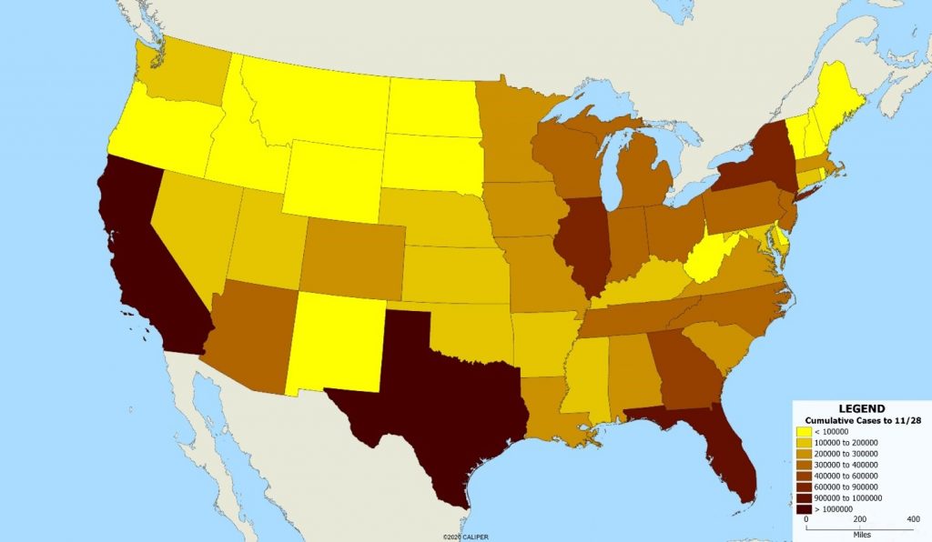
Clearly, this is somewhat misleading since the states with the most cases are also the most populous. If we standardize the map by displaying cases per 100,000 population, the map is radically different, as shown below.
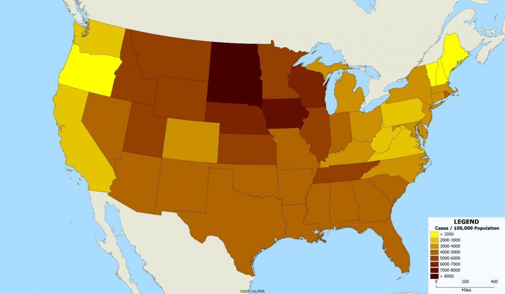
This demonstrates a second problem – that of the scale of the units involved. Clearly, the best approach would be to map the individual cases, since it is individuals not areas who contract the disease. But the data simply is not available, at least publicly, for this purpose. Note the improvement in our understanding when we use county level data, shown below.
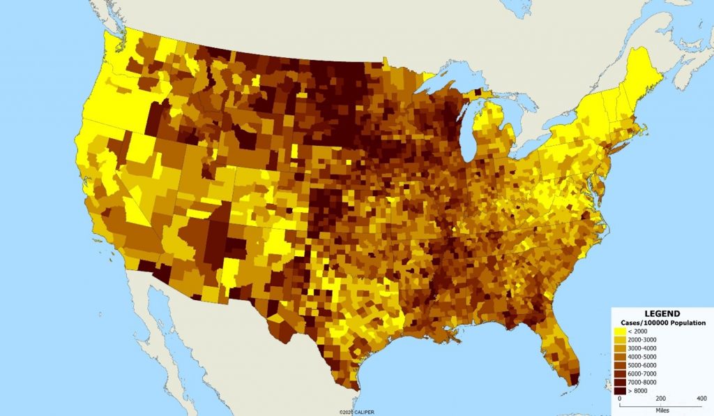
The variations within some states are as large as the variations between states – look at New York for example, where upstate areas have dramatically lower case rates. Treating ‘New York’ or ‘California’ as a single unit for public health disease control is clearly less than ideal, but even within a single county, the differences in disease incidence are striking. We can see that in looking at the map below of San Diego County by ZIP code.
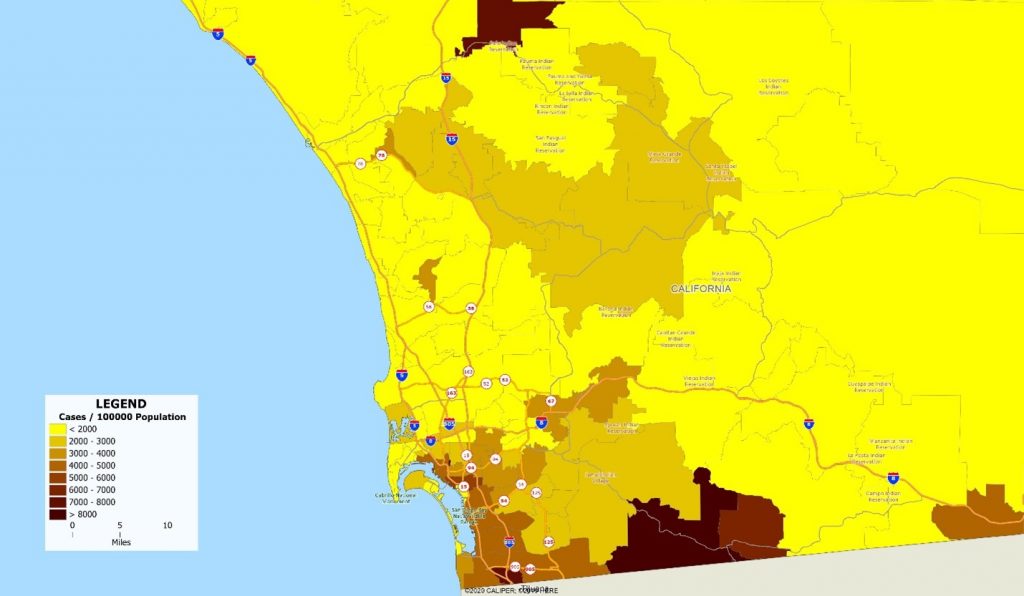
San Diego, and even the state of California as a whole, has moderate case rates compared to many of the country’s urban areas. Indeed, when Los Angeles and San Francisco were completely locked down, San Diego was basking in relative freedom. But hidden within the low overall rates are pockets of extremely high incidence which rival the worst areas of the country.
The lesson is that the size of the administrative units over which data is collected and reported matters. What might seem like a good policy at one level of geographic detail quickly disintegrates at local levels.
Geography matters.

Recent Comments