If the purpose of a site report is to convey an understanding of trade area demographics, it only makes sense that maps were soon included. Even cut-and-paste topographic maps, with hand drawn radii, brought the numbers on the page to life. The early attempts at automation were generally simplistic, showing highways, municipal boundaries, and sometimes parks, airports, and other landmark features.
The simple maps, such as the one below, did manage to convey the essentials and answer the question – what is in the trade area?
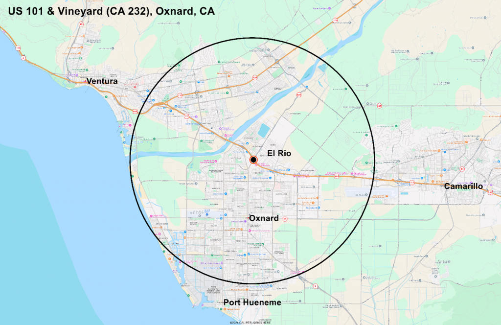
A simple map, like this one on a Google image, does convey the essentials – the trade area straddles the communities of Ventura, El Rio, and Oxnard, and extends beyond the built up area in several places.
When the use of satellite imagery became economically and technically viable, most of the subscription platforms for demographic reports quickly switched over. While there are some clear advantages of realism, we have generally been of the view that little information is added to help the user understand the site context.
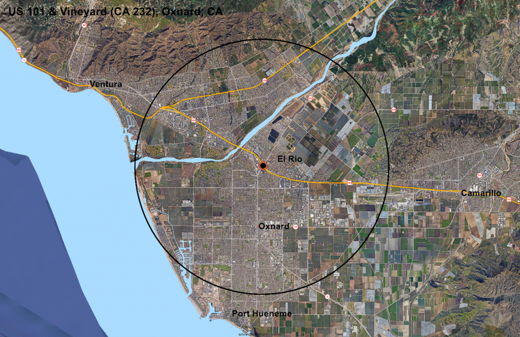
It is virtually impossible to tell from this image anything more than three categories – urban, agricultural, and undeveloped. Yes, you can put your nose on the map and begin to make out some of the details – the large buildings on the east side of Oxnard are clearly not residential, but good luck identifying even the retail streets from this view.
We think there is a better way. Using the AGS national parcel file as the base and a broad range of cartographic and tabular databases, we classified parcels by land use. To speed up map rendering, we dissolved the boundaries between adjacent parcels with the same land use classification. The result is an immediately interpretable map that actually fulfills its purpose:
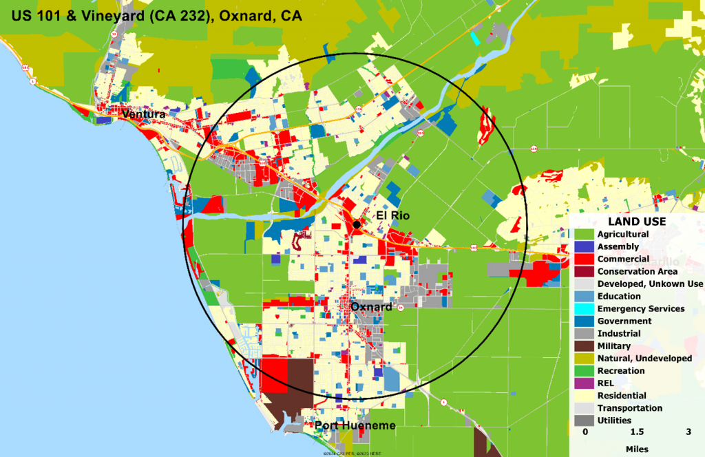
The commercial streets – Oxnard Blvd and West 5th Street in Oxnard, and Main Street in Ventura are immediately recognized, as are the industrial areas in east Oxnard. Further, the miliary base at Port Hueneme, which is not easily identified on the satellite image, draws immediate attention.
And of course, the land use classification can be muted and displayed on top of any base map, including satellite images, giving users the best of both.
Time to elevate your site reports? Ask your software provider to add generalized land use maps and expand your toolkit.
Done well, a picture is truly worth a thousand words.