As we entered this year, we knew a major milestone was on the horizon: 30 years in business. One of our first conversations was whether our branding still reflected who we are today—and who we plan to be in the next 30 years.
Over the past few years, we’ve expanded our geographic coverage well beyond the United States to include Canada, Puerto Rico, and now Mexico. With that growth, our old U.S. map outline no longer told the full story of who we’ve become. So, a yearlong project began to evolve our brand. But to appreciate where we’ve arrived, we must start at the beginning.
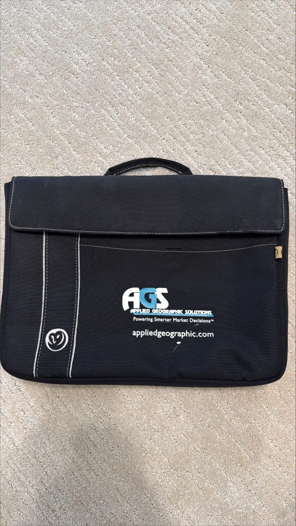
When AGS was founded, Gary sketched the first logo by hand—a simple black-and-teal design featuring our name and tagline. Though the digital file is long gone, we still have a few relics from that era, including my well-traveled college laptop case embroidered with the original logo (yes, it’s tucked away as part of AGS history for my kids someday).

About fifteen years ago, we introduced the logo most of you recognize today. At the time, it fit perfectly: we were a U.S.-focused demographic data company, and the map outline captured that identity. For many years, it represented us well—but as AGS evolved and our data footprint expanded internationally, it became clear that our visual identity needed to evolve, too.
To bring our new look to life, we partnered with Group M7 out of Tyler, Texas. Working with a creative team outside our industry proved invaluable—they pushed us to think differently about how we present ourselves.
Before design even began, they sent us a questionnaire that made us dig into our company culture. What would AGS’s theme song be (“Hotel California”, because it’s Gary’s favorite and has become somewhat of an inside joke about our company culture)? If we had a physical office, what color would the walls be (probably not a color, but some kind of map wallpaper)? Those exercises helped us articulate not just what we do, but who we are.
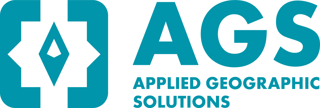
When Group M7 translated that understanding into a visual identity, they truly captured the spirit of AGS—today and for the future. Our new logo blends heritage and innovation. The color palette pays homage to the teal of our original 1990s design, a reminder of where we started. At its center, a compass rose anchors us in our roots as a geography company. On either side, a pair of braces offers a subtle nod to the coding and data that power everything we build.

We love the new logo and hope that you will, too. It serves as a nod to the evolution of AGS while honoring our history through our original brand colors. We hope it reminds you that, just as we’ve grown, we’ve never forgotten the relationships and trust that built this company.
