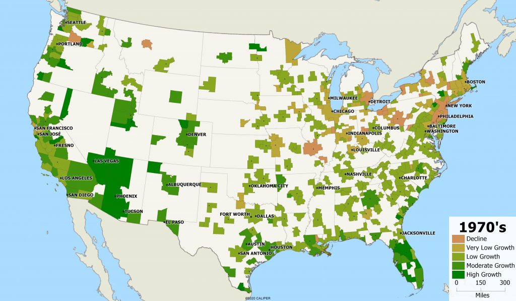
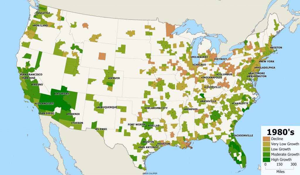
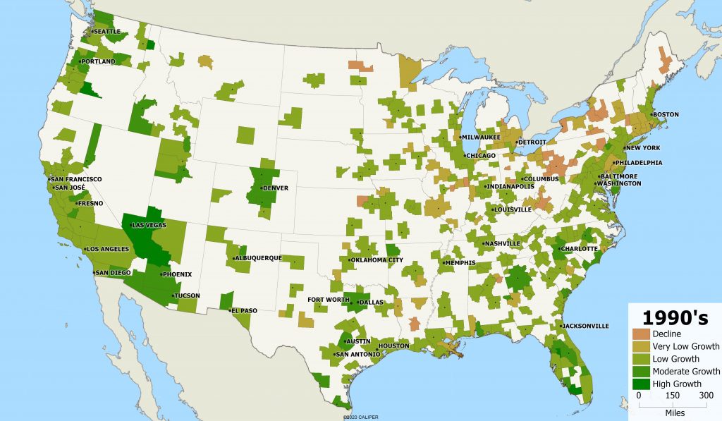
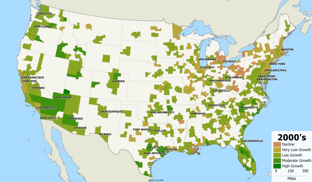
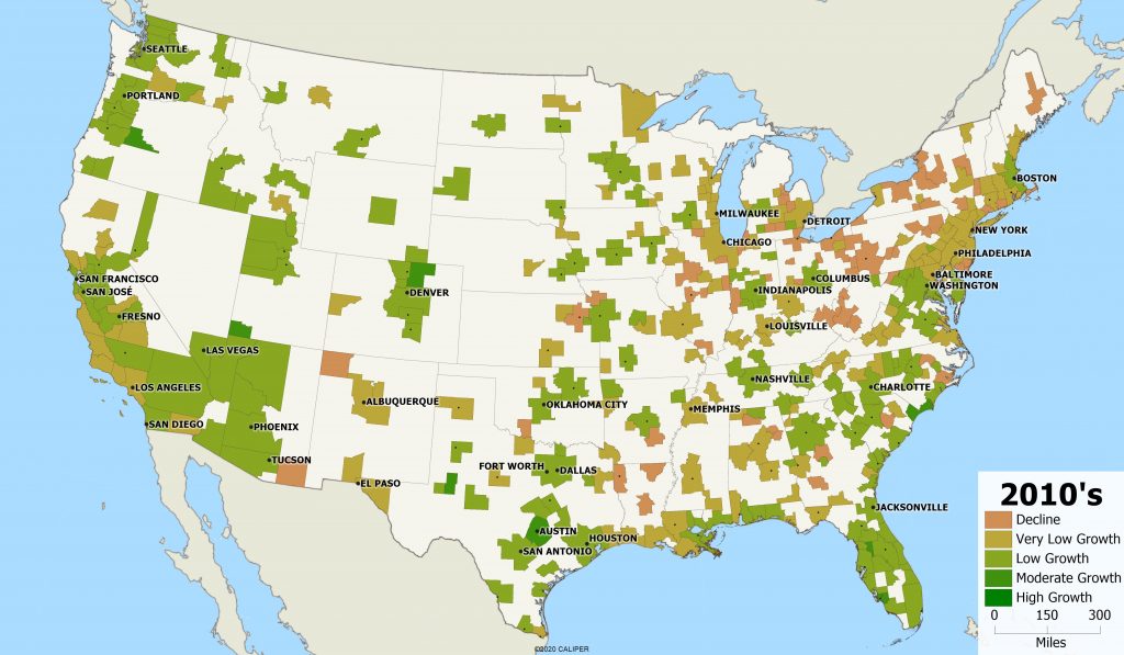
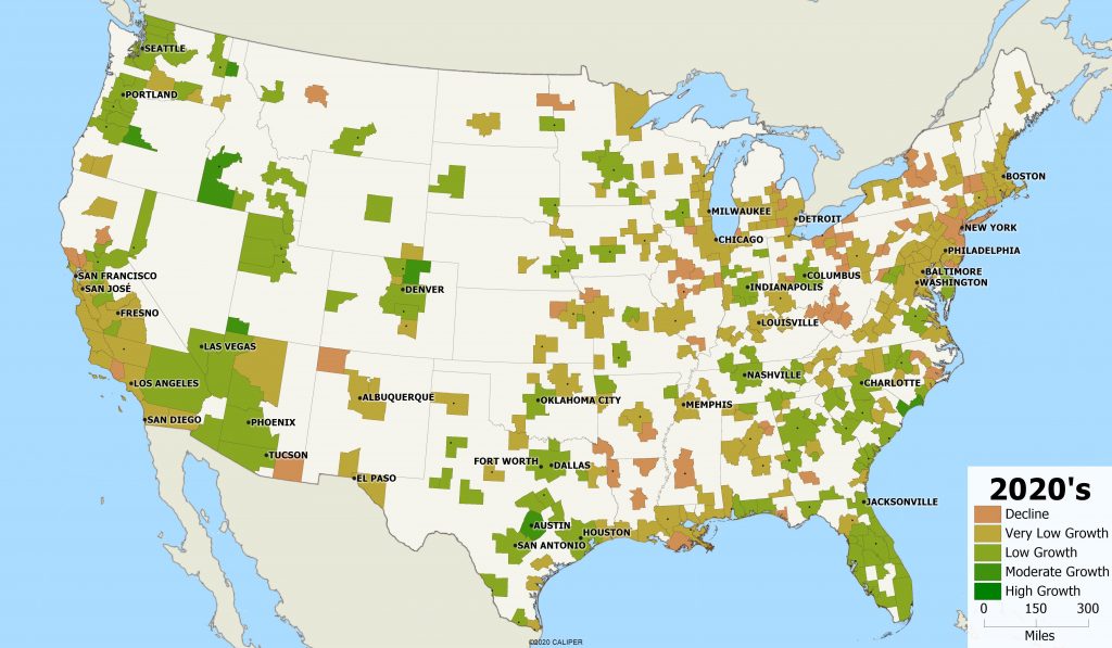
Last week, we looked at the population change over the last 50 years. This week, we are looking at the metro level change by decade, from 1970 to 2030 (projected). We see some interesting patterns emerge in the maps.

It seems as if metropolitan areas have fads and trends, depending on the decade. Metros in California, Arizona, and southern Nevada went from being “the” destination in the 1960’s and 1970’s to having nearly no growth this decade. Similarly, Florida had major growth in their big cities early on, but outside of Orlando, has had relatively low growth over the last few decades.
Want to know where the next hot place to live is? In the coming decade, it seems like Austin, Texas, Boise, Idaho, costal North Carolina, and some smaller metro areas in the western U.S. are going to be popular places to move.
New York city saw growth in the 1990’s, when there was a small resurgence, but other than that has seen an overall decrease. It will be interesting to see the impacts of COVID-19 on NYC. As many jobs have moved to a work from home model, and families move out of the city, will there be a large decline?
Not surprising, cities like Detroit, Buffalo, and Pittsburgh have been declining for decades and continue to decline as manufacturing jobs have moved out of these areas.
