For years, the standard trade area report came with a map showing the site location and the radius or isochrones used to generate the data. That map served two purposes. First, it gave the buyer of the report some confidence that the site was correctly located. Second, and more importantly, the map gave the reader some background on the location itself. Where are the highways, what is the extent of the built up area? Until the advent of decent national GIS frameworks, the preferred map source was usually from topographic maps. Paper maps, cut and pasted together, with the site and radius added by hand.
The typical map was simple, but effective. The examples below are for the Oaks Mall in Thousand Oaks, California.
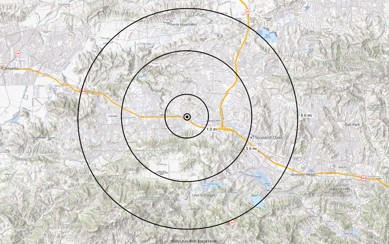
While some topographic maps are easy to interpret, this example is among the more difficult given the terrain. But you can see the footprint of the city in the valley, the main routes, and certainly the areas of the trade area which are not populated.
When satellite imagery became available and at a reasonable cost, many site report systems shifted to it. The early maps were at a lower resolution and not particularly interpretable but put into systems because of the coolness factor. Current satellite imagery, while at a much higher resolution, is excellent for seeing the ‘built up’ area but not so effective at distinguishing between office and apartment buildings.
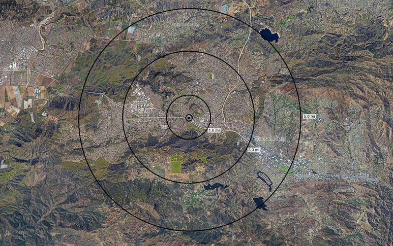
Many maps with a satellite image base will overlay these with the road network for clarity and can even include shading parks and major features. On the map here, it is easy to spot the large buildings northwest of the site, but it is nearly impossible to tell the difference between residential and commercial areas other than this.
And here is where the land use map earns its keep – either as a base layer or as a shading over the satellite image:
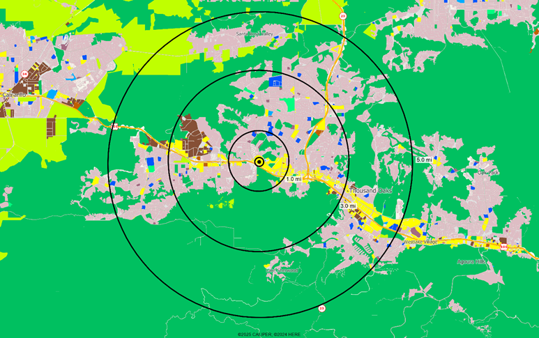
Residential areas are clearly delineated in pink, and the distinction between the commercial zone which follows the Ventura Freeway and the industrial zone to the northwest of the site. To a location analyst considering a city they may not know well, this shows beautifully the layout of the potential trade area.
Tracking Land Use Change
But the land use classification has uses beyond visualization. Because it is based on individual parcels and we track land use quarterly, we are able to provide some key statistical tables for any geographic area that include the number and size of parcels by land use classification. Further, because we run our land use classification models every quarter, we can provide both quarterly and annual change summaries. This allows both us and users to identify in a very timely manner where new development is occurring. Equally important, it allows us to capture changes like the conversion of old industrial areas to residential long before these changes show up in the ACS.
Finally, when married with a wide range of other development data – building permits, postal system changes, and changes to the road network, we can produce accurate and timely maps showing users the ‘hotspots’ where growth has recently occurred, is occurring now, or is occurring in the next couple of years.