Most of the data which is utilized in the location analytics world is collected from individuals but is disseminated in aggregated form within various geographic areas. In the first of this series, we considered the problem of the ecological fallacy – the incorrect assignment of group behavior to individuals. Here we consider a related problem, which has become known as the MAUP, or ‘modifiable areal unit problem’.
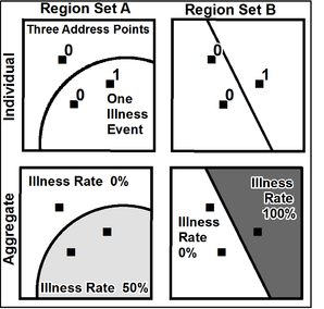
We often use areal units such as ZIP codes, census blocks, and counties without giving much thought to them. Stan Openshaw, in The Modifiable Areal Unit Problem, said “the areal units (zonal objects) used in many geographical studies are arbitrary, modifiable, and subject to the whims and fancies of whoever is doing, or did, the aggregating.” The fundamental problem is that different aggregations of an area – both scale and shape – can result in substantially different statistical inferences. Below, we have a trivial example which clearly shows the problem:
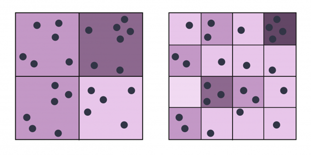
The ability to create such differing results diminishes with the number of areas and the number of points involved, but the example below shows that even with regular shapes, the relative size of the areas can mask important patterns:
These regular grid cells are as arbitrary as any other shape – and if we allow the grid cells to be of different sizes, the opportunity for mischief grows exponentially. The most famous cases tend to be political, where the boundaries are gerrymandered to engineer a desired outcome. As the example below from Wikipedia shows, this can result in a case where those who draw the boundaries determine the winners of the election.

The problem is not usually solvable, due to the tension that arises between our desire to study individual behavior and the fact that all we really have access to is group behavior. In some cases, the only data we have is a pre-determined set of spatial units which we cannot modify, even if we discover issues therein. But we can offer some guidelines and cautions:
- Choose the smallest spatial aggregation for which you have data available. If you have zip code data, use it rather than county data, and if you have census block data, use that instead of block group. The larger the average size of the units, the more similar they become.
- Understand the purpose for which the geography level was created. Is it administrative, legal, or statistical? A system created to efficiently move the mail may not be the best for analyzing health care outcomes. But that same system is immediately recognizable to most, whereas a purely statistical aggregation lacks familiarity and meaning to users.
- Be aware of scale differences between units, not just the average size, but the range of both area and people. Trying to compare the demographics of Los Angeles and Loving counties is generally pointless given the massive population size differential.
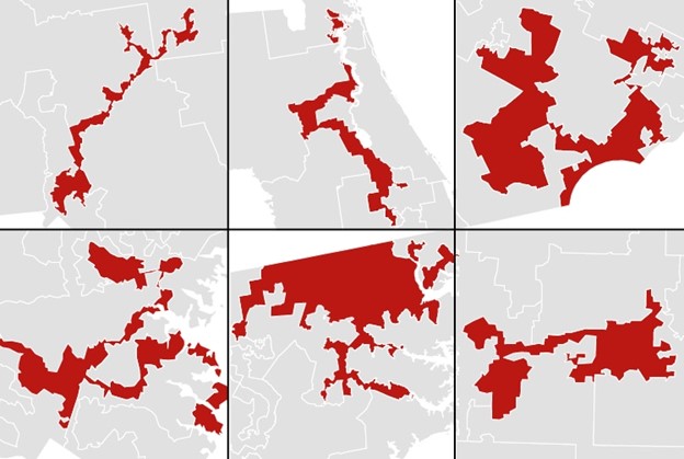
- Be aware of spatial units which look rigged, they were likely created for a purpose which doesn’t match yours. The map below includes some truly wall of fame gerrymandered districts, again taken from a Washinton Post article some ten years ago.
As a final aside, for those interested in reading some of the short but practical works in spatial analytics, the CATMOG series is freely available (with a few missing volumes) in PDF format at https://github.com/qmrg/CATMOG.