
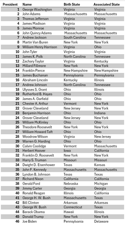
So far, there have been 46 presidents of the United States of America, from George Washington to Joseph Biden. In theory, they should hail from all over the country; however, when you think about where they were born, it is likely that you think about the East Coast. There has long been a fascination with the distribution of the presidential birthplaces, and it has long been thought that there has been a geographic bias towards the Atlantic shore.
Virginia has led the parade with 8 presidents, followed by Ohio with 7 and New York with 5. Many states have failed to yield a single president. And interestingly, no presidents have hailed from two of the original thirteen colonies – Rhode Island and Maryland.
When compared to the current distribution of the population, the concentration of presidential birthplaces seems quite biased. There are a few issues of course. Do you count Grover Cleveland (22nd and 24th) as two separate entries? How do you deal with Andrew Johnson, whose birthplace is a matter of dispute between North and South Carolina? How do you account for the fact that 200 years ago, none of the three most populous states today were even a part of the US?
And what to make of the argument that one’s birthplace doesn’t matter? Ronald Reagan was born in Illinois but made his name in California where he served as governor, and Abraham Lincoln was born in Kentucky but is hailed as the president from Illinois.
Here is the list, from Washington to Biden, including both the state where they were born as well as the state they are most associated with:
What we do know is that you can’t look at the current population distribution and say that California has been treated unfairly, since it hasn’t always been the most populous state. While you might expect 10% of presidents to hail from that state, that fails to account for hundreds of years of changing population. What we did instead is to take the state populations at the time of each census since 1790 and use an average of those figures. Since the rules are that the president should be 35 or over, the apportionment should be 35 years prior to each president taking office. Having little pre-1790 data, we chose to simply assume that the distribution of the population in the 1740s was similar to that of 1790.
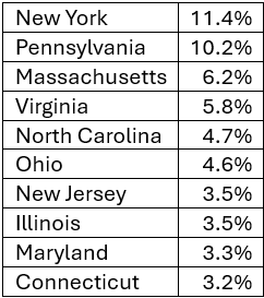
But we also wanted to take account of the fact that the enslaved population could not have reasonably been included in the calculation, as they were a massively undercounted and underrepresented population, so we used what was available, the free population of each state to 1860. For each state, we calculated its time weighted share of the national population. While California may have nearly 10% of the current population, its weighted share is just 2.5%. The top ten states for expected representation are:
California, with nearly 10% of the current population, has a weighted population of just 2.4%, tied with Tennessee. To make things simple, we averaged the count of ‘birth state’ and ‘associated state’ and compared this to the expected number of presidents based on weighted population size. Is the spatial distribution of presidents biased? Absolutely! The top ten and bottom ten states for representation bias –
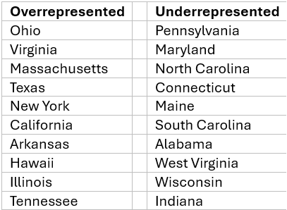
The appearance of Virginia and Massachusetts at the top of the list is understandable given that these were the two hotspots of the revolutionary war and most of their presidential representation was in the early years of the republic. While Pennsylvania sits at the top of the list, they have had multiple presidents. Maryland probably takes the under-represented prize – with 3.4% of the weighted population, no president has either been born in the state or known for being from there. Maine, at present a small share of the population, has historically accounted for 2.1% of the total, but has not yielded anyone of presidential stature to date.
What does this prove? Not much, but it does highlight the critical importance of definition in any problem we are attempting to describe or model statistically.

Recent Comments