

This week, we looked at the U-Haul article that declared the top growth states for population based on where one-way trucks are leaving from, and where they are going. But as it turns out, they aren’t the only company that creates this list, in fact, we found 5 articles from 5 companies touting their own lists. But no two lists are the same. So, who is right? Likely none of them. As it turns out, it is pretty easy to create the data you want to see, especially if you are using a limited sample.
The five companies, U-Haul, Allied, North American, Atlas and United all published these lists in the recent weeks. Overall, they used a few different methodologies to create their lists. U-Haul looked at the balance of 1-way rentals, a net in, net out scenario. Allied, North American and Atlas all use a ratio of inbound and outbound trucks. United takes a percentage of the inbound total into account for their lists. In the end, no two lists are the same, but you can see a chart of the top 5 and bottom 5 for each company below.
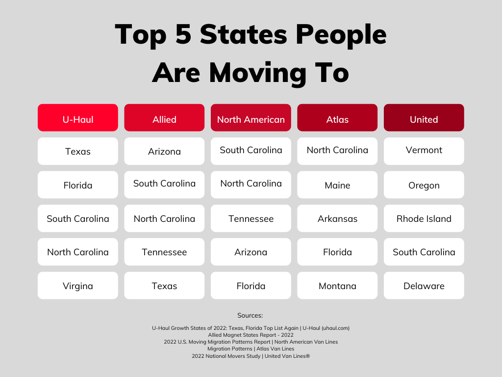
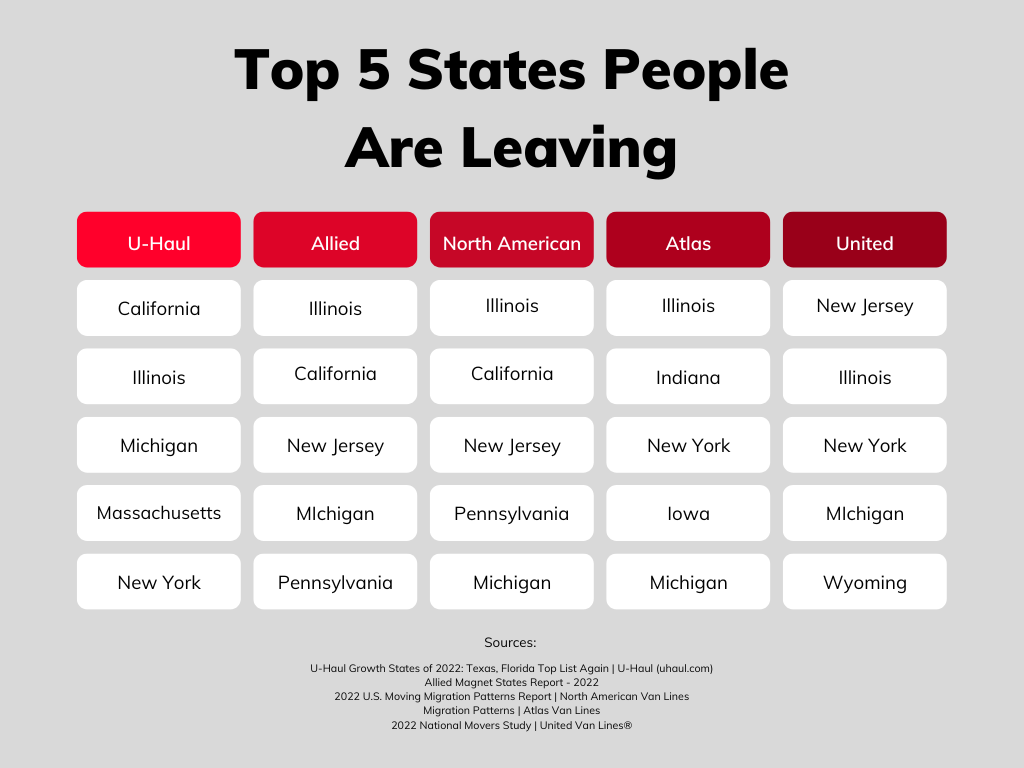
From our analysis, we can see that the Ratio method is exceedingly more likely to result in a small state being at the top or bottom of the list, whereas the Net Flow (In – Out) is more likely to result in large states being at the top of the list (or bottom). U-Haul favors large states at either end, as you can see with Texas/Florida at the top, and California at the bottom. All these moving companies have the total number of Inbound / Total moves. This is less likely to mean that large states are at the top or the bottom. United has Vermont as the highest inbound, though it doesn’t even hit on the top 10 list of U-Haul at all. If we look at the top 5 across the board, no state appears in all five lists, which seems improbable giving all that we know. North Carolina and South Carolina each get on 4 of the 5 lists, while Tennessee and Texas appear on only 2 of the 5 lists. On 5 lists, we have 16 different states in the top 5, which includes Rhode Island (which we find really unlikely). To be fair, the declining states are much more consistent, but even then, we have 10 different states appearing in the bottom 5.
So how are we getting such different lists? Especially if they are using the same basic methods? From what we can speculate, this is likely due to regional differences in the market share.
Is there a lesson here? First, when looking at state or county level, size matters. Big states are much more likely to appear on lists if the data isn’t “descaled”. Conversely, when you descale things, the smaller the area, the more likely it shows up. Exhibit caution when using data for administrative or political geographic areas which massively differ in size (e.g., 40 to 1 difference in population at the state level). Second, pause to consider the biases which may be in the data (like geographic market share). In this instance, four moving companies are using the same technique, yet the results are significantly different.
If it wasn’t already obvious, we won’t be incorporating this data into our own methodology, but it is fun to look at lists like these. You may, however, find a good deal on moving to California, as it is imperative for U-Haul to get a truck back into the state only for it to be rented the next day for a move to Texas.

Recent Comments