
This week as we look at the Consumer Expenditures database, it is helpful to look at a specific example. We looked at elderly care expenditures by household nationwide to show how this database functions.
The number of households reporting these expenditures is fairly low and tends to be concentrated within age groups in the 45-65 range (who have elderly parents to care for) and within this age group tends to peak in the middle-income range. Low-income households caring for elderly parents don’t spend much money, and high-income households are much more likely to not have a parent living with them. So, we have several patterns going on here –
- Average household expenditures at a neighborhood level will tend to be higher in areas where you have a high percentage of households middle-aged and middle income.
- In areas with older residents, they do not have high expenditures for elderly care, since they are likely healthy enough to live on their own.
- The cost of elderly care is very dependent upon location. Urban areas have higher costs associated with general living expenses, and the cost of elderly care is no different.
For the maps, we looked at elderly care expenses nationwide. Overall, these average about $60 per household annually. The first shows annual average expenditures. They tend to be highest in the urban coastal areas of San Francisco and Los Angeles in California and the northeast. The lowest areas are rural areas, where those who are elderly are more likely to live with family members and services are often hard to obtain.
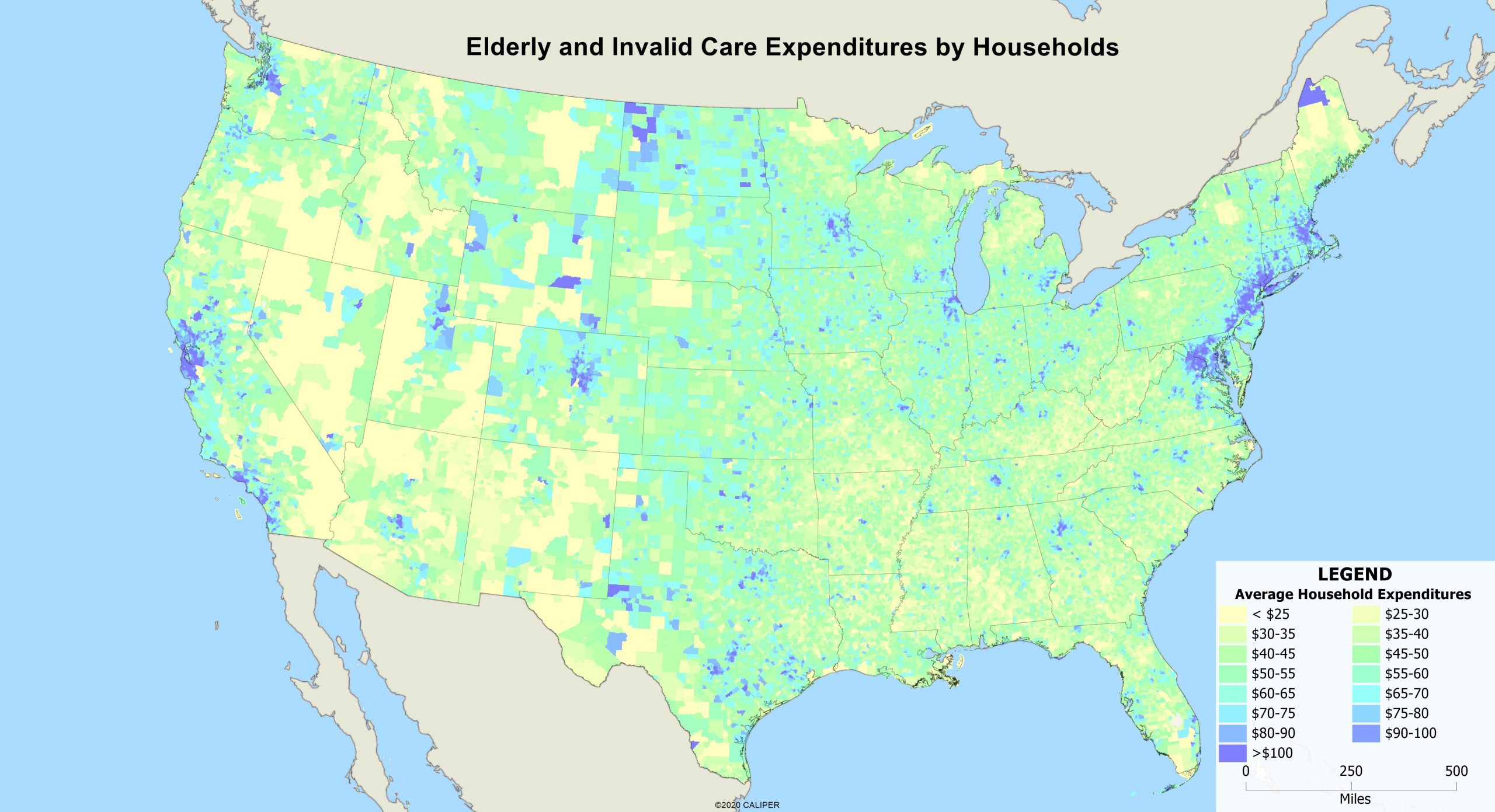
Florida is interesting, because you would expect high expenditures, but you don’t get clusters of them outside a few places. This is largely because the older people there are mobile and healthy and more often than not, part time residents.
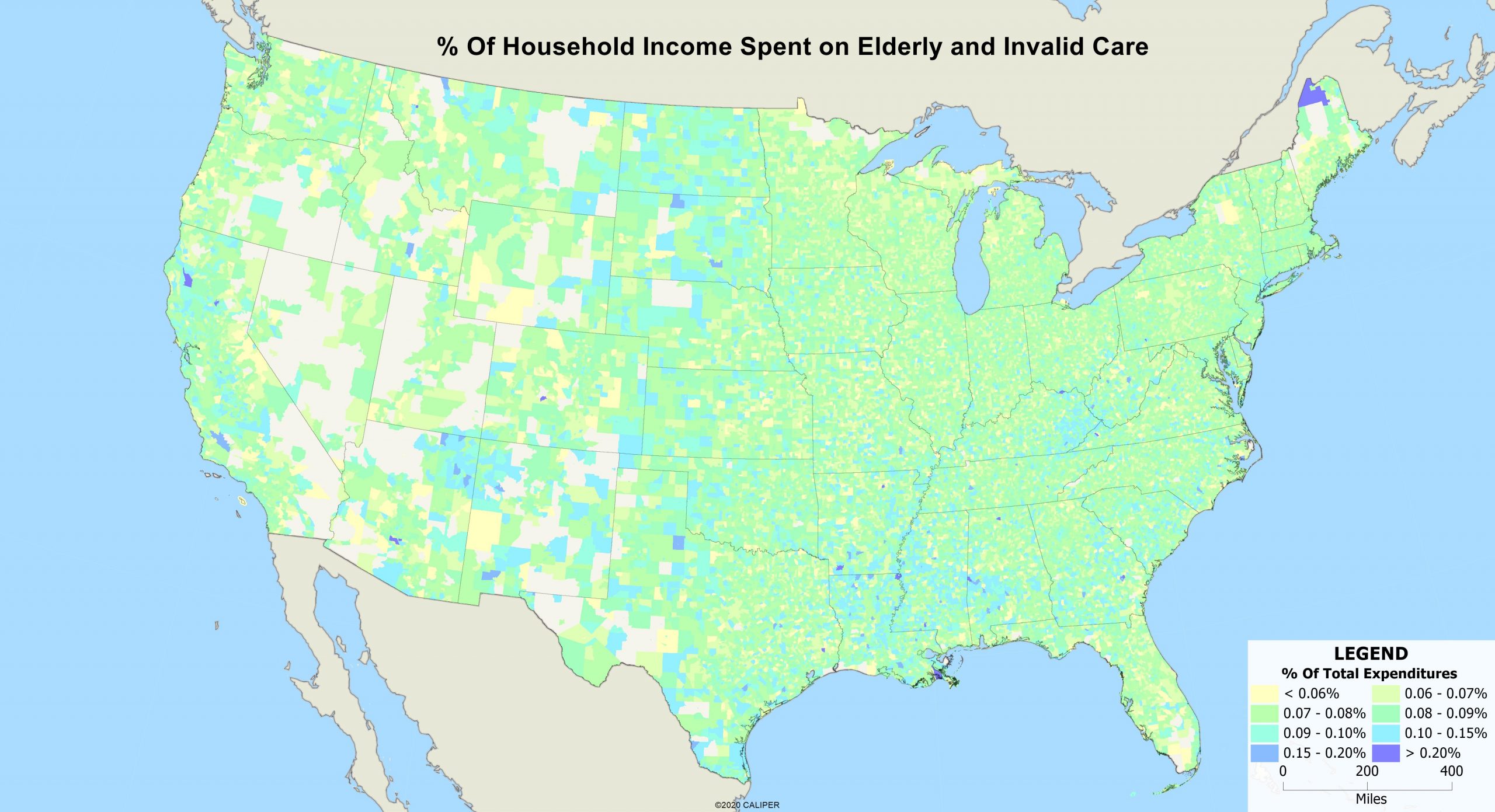
The second map shows what percentage of household income is spent on this category. For those in the rural south and rural west, elder care is a higher percentage of their income. On the other hand, the percentage is relatively low in major urban centers where incomes are higher and as a result, the burden is lower.
As you can see, these maps show two very different situations, depending on how you want to look at the data. Interpreting the Consumer Expenditures data can take some thought, but when used correctly, can have significant benefits to those in retail.

Recent Comments