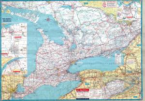
One of my earliest memories growing up was sitting with my grandmother at the kitchen table in front of a large wall map of North America, where she would quiz me on the provinces and states and their capitals. By the time I went to school, I knew them all. I developed a love for maps, especially highway maps, and had a sizable collection by the time I was a teenager.
There was absolutely no question that I would study geography in university, and my plan all along was to be a professor. My worst college grade was in cartography, mainly because I pretty much was a failure at freehand drawing. Contour maps were well beyond my pay grade. Happily, I was an undergraduate in the late ’70s, when computer cartography was in its infancy. My first real programming was in Fortran, and specifically in building Thiessen polygons. Mapping in those days was primitive – we would shade maps by using backspacing and overprinting on character based line printers, taping together individual pages to make large maps. Presentation quality? Not so much. Color? Yea right.
But the technology was rapidly developing, and I set out to marry this new computer cartography with spatial statistics. All was according to plan, and had I would have accepted a tenure-stream job at a great university when I was but twenty-three. But for one careless remark by the chairman of the department. I was to be expected to publish various aspects of my dissertation over the first few years. Given my short attention span, I was already quite bored with it and couldn’t bear the thought of having to endlessly rehash it for the next decade. I not only turned the job down, but fled academia immediately.
The release of census data electronically combined with the rudimentary mapping systems of the time (e.g. we wrote our own software to make color maps on HP pen plotters) became the early geodemographics business of the ’80s.
While much has changed and the mapping capabilities exponentially better, it still comes down to the magic of telling a story with a map. I still love maps, and the web has made them more accessible and usable by all. I sometimes waste much time on Reddit, looking at /r/mapporn, where you can see lots of examples of excellent maps, and lots of really bad ones.
Being a ‘manufacturer’ of spatial data, I have access to nearly 30,000 variables which we can map for detailed geography nationwide. The number of interesting maps which can be created is almost limitless, which reduces employee productivity at AGS.
You can spot a cartographic purist by watching their facial expression when somebody rotates a paper map so up is the direction they are going. Or the look of disgust that they simply can’t suppress when they climb into a car where the GPS is set to ‘direction of travel is up’. Please stop, as it is greatly annoying to us. I would use the word ‘offends’, but these days that word is so overused as to be meaningless. The only beneficiary is my chiropractor, who works out my neck kinks because I have to constantly tilt my head in order to get north up.

